As a designer or showroom manager, staying on top of the latest design trends is essential to providing your clients with the most current and stylish options for their spaces. One trend that is gaining momentum is the use of vibrant and bold colors, and one shade in particular that is set to take the design world by storm is Viva Magenta – the color of the year. In this blog post, we’ll explore what makes wallpapers designs using the Viva Magenta color palette so special and how you can incorporate this bold and exciting color into your design projects.

What is Viva Magenta?
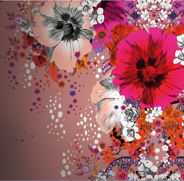
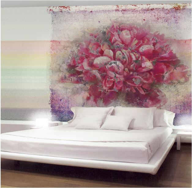
Viva Magenta is a bold and vibrant shade of pink that is set to dominate the design world in 2023. The color is a striking combination of magenta, fuchsia, and raspberry, and has been chosen as the color of the year for its ability to evoke a sense of energy, positivity, and creativity.
Why is using the Viva Magenta color palette for wallpaper a good idea?
The Viva Magenta color palette is an exciting and versatile group of colors that can be used in a variety of design applications, but it is particularly well-suited for wallpaper designs. Here are a few reasons why:
Adds depth and dimension
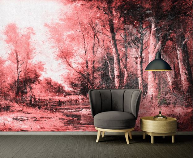
The bold and vibrant nature adds depth and dimension to wallpaper designs, creating a sense of movement and energy. Whether used as a bold accent or as the main color in a design, any color similar to Viva Magenta can bring life to a space and make it feel dynamic and engaging.
Can be used in a variety of design styles
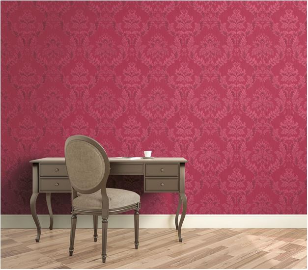
Despite its bold and vibrant nature, Viva Magenta or similar colors can be used in a variety of design styles, from modern and minimalist to classic and traditional. Whether used in a bold and graphic pattern or a subtle and abstract design, the color palette can be tailored to fit any design style or aesthetic.
Pairs well with other colors
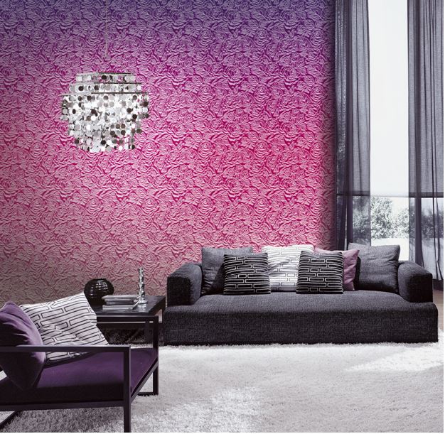
The Viva Magenta color palette pairs well with a variety of other colors, including neutrals, earth tones, and bold and bright hues. Whether used as a standalone color or as part of a larger color scheme, these bold colors can add a sense of energy and excitement to any space.
Creates a focal point
Viva Magenta is a bold and attention-grabbing color, so its color palette makes the perfect choice for creating a focal point in a space. Whether used as an accent wall or as the main color in a wallpaper design, the Viva Magenta color schemes can draw the eye and create a sense of drama and impact.
How can you incorporate colors like Viva Magenta into your wallpaper designs?
If you’re looking to incorporate colors similar to Viva Magenta into your wallpaper designs, there are a few things to keep in mind.
Choose the right pattern
When incorporating a color like Viva Magenta into your wallpaper designs, it’s important to choose the right pattern for the space. Whether you opt for a bold and graphic print or a subtle and abstract design, the pattern should complement the color and help create a cohesive and visually engaging space.
Consider the lighting
The lighting in a space can have a big impact on how a bold and bright color is perceived. When selecting a wallpaper design, consider the lighting in the room and how it may affect the wallpaper. If the space is well-lit, a Viva Magenta-like color may appear brighter and more vibrant, while in a dimly lit room it may appear darker and more subdued.
Pair it with the right colors
When incorporating a color within the Viva Magenta palette into a wallpaper design, it’s important to pair it with the right complimentary colors. Neutral tones like white, gray, and beige can help balance out the boldness of the color, while earth tones like brown and green can add a sense of warmth and depth. Bright and bold hues like yellow, turquoise, and purple can also be used to create a vibrant and energetic ambiance.
Use it strategically
Because Viva Magenta is such a bold and attention-grabbing color, it’s important to use it or colors like it strategically within your wallpaper designs. Consider using it as an accent color or in a smaller area of a space, rather than covering the entire room with the color.
Consider the overall design aesthetic
When incorporating a color from the Viva Magenta palette into your wallpaper designs, it’s important to consider the overall design aesthetic of the space. If the space is more traditional or classic in style, a subtle and abstract design with a Viva Magenta-like accent may be more appropriate. On the other hand, a bold and graphic Viva Magenta-like pattern may be more fitting in a modern or contemporary space.
Whether used as a bold accent or as the main color in a wallpaper design, any color within the Viva Magenta color palette can add depth and dimension to a space, create a focal point, and complement a variety of design styles and color schemes. As a designer or showroom manager, incorporating a color from the Viva Magenta palette into your wallpaper designs can help you stay on top of the latest design trends and provide your clients with stylish and current options for their homes.